EMBRACE - SENIOR CAPSTONE
For my senior graphic design capstone at Rochester Institute of Technology, I created the brand Embrace as a way to bring more life to diabetic medical equipment. As a Type 1 diabetic myself I noticed a market gap specifically relating to compression socks, which many diabetics end up needing at some point in their lifetime. Through extensive research I found that there were mainly compression socks on the market with simple, dull colors such as black, gray, and white. This did not leave room for self expression, creativity, or variety for people with more colorful personalities that also have no choice but to wear compression clothing. With Embrace, the goal was to design fun and expressive socks without
sacrificing quality.
As I was designing the line of socks, I decided that there are many other applicable ways to take this creative idea to other diabetic supplies. In addition to the compression socks I designed CGM tapes, a diabetic supply pouch, pump site adhesive patches, blood glucose monitor skins, and an array of apparel.
COMPRESSION SOCKS
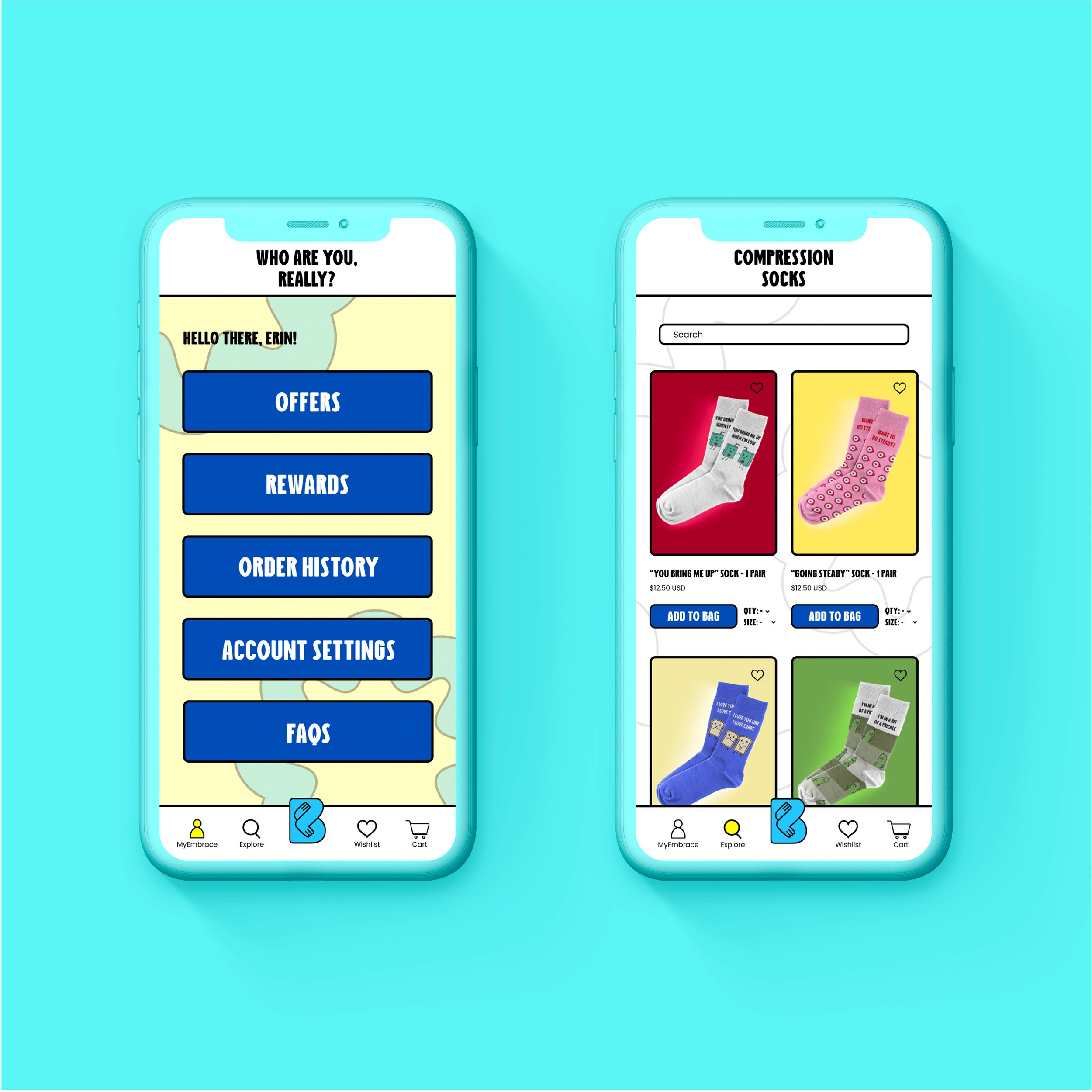
Each sock takes inspiration from some aspect of daily life living with diabetes. Whether it’s a nod to pricking your finger to test your blood sugar, CGM monitoring a steady glucose, or needing to eat or drink certain foods in a low blood sugar emergency. The humor is subtle yet effective, and accomplishes the main objective of bringing color and fun into the compression sock market.


MEDICAL ACCESSORIES
In addition to compression socks, diabetics more frequently use a vast array of medical devices to maintain their health and manage their diabetes. These supplies can include Continuous Glucose Monitors (CGM), insulin pumps, alcohol swabs, and blood glucose monitors to name a few. I felt that creating other accessories to accompany the socks could give a sense of unity and cohesiveness to the products diabetics use on a daily basis. This way, if a customer wanted to, they could match their socks to their pump site adhesive for example.


APPAREL
I designed the Embrace apparel not only to have items that diabetics and non-diabetics could purchase to support their loved ones and the brand, but also with the thought that if this were a real company, all profits from apparel sales would go towards organizations that are working to find a cure for Type 1 diabetes. It would be a great way to not only bring awareness to the brand, but gain a sense of community, raise awareness for Type 1 diabetes, and raise money for a great cause.


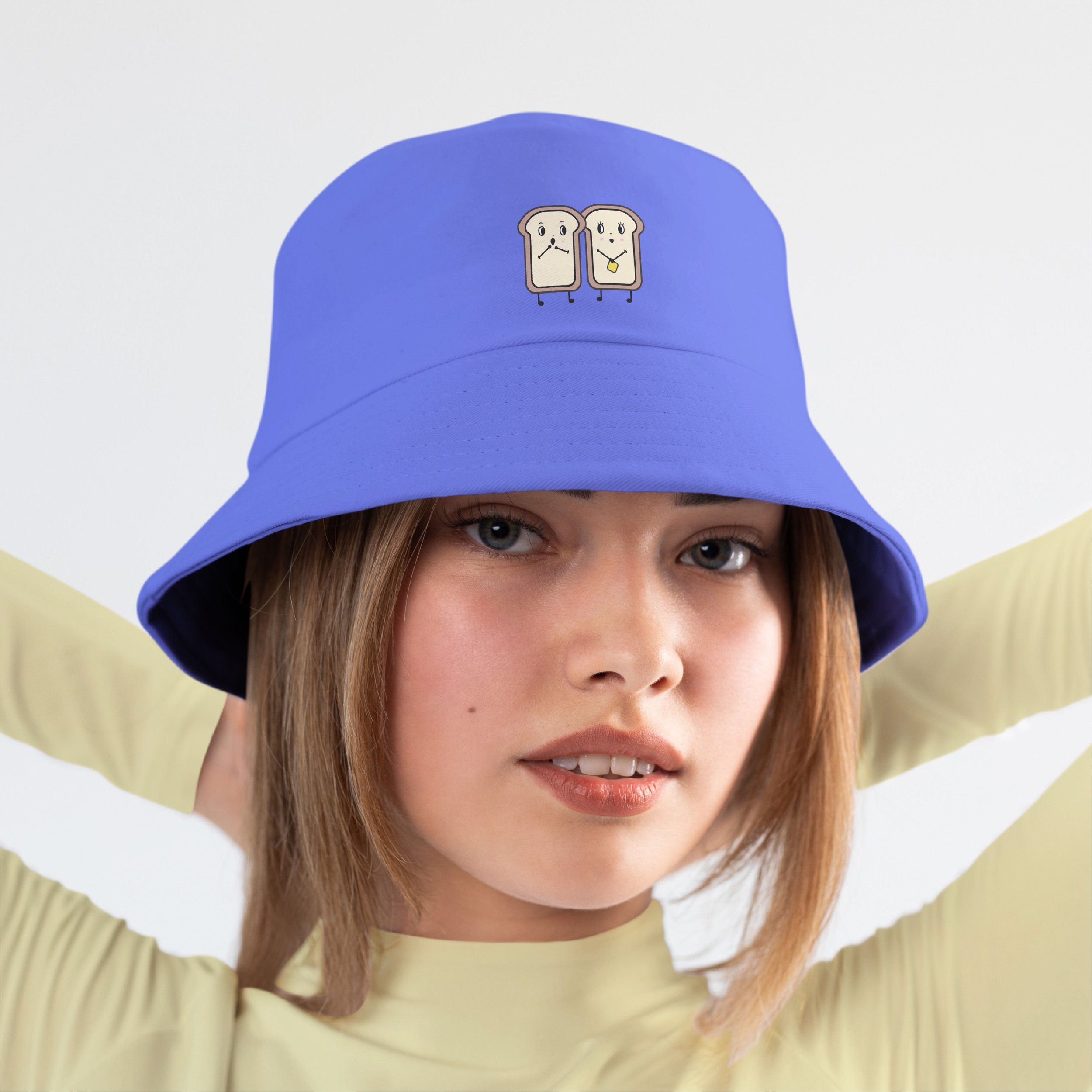
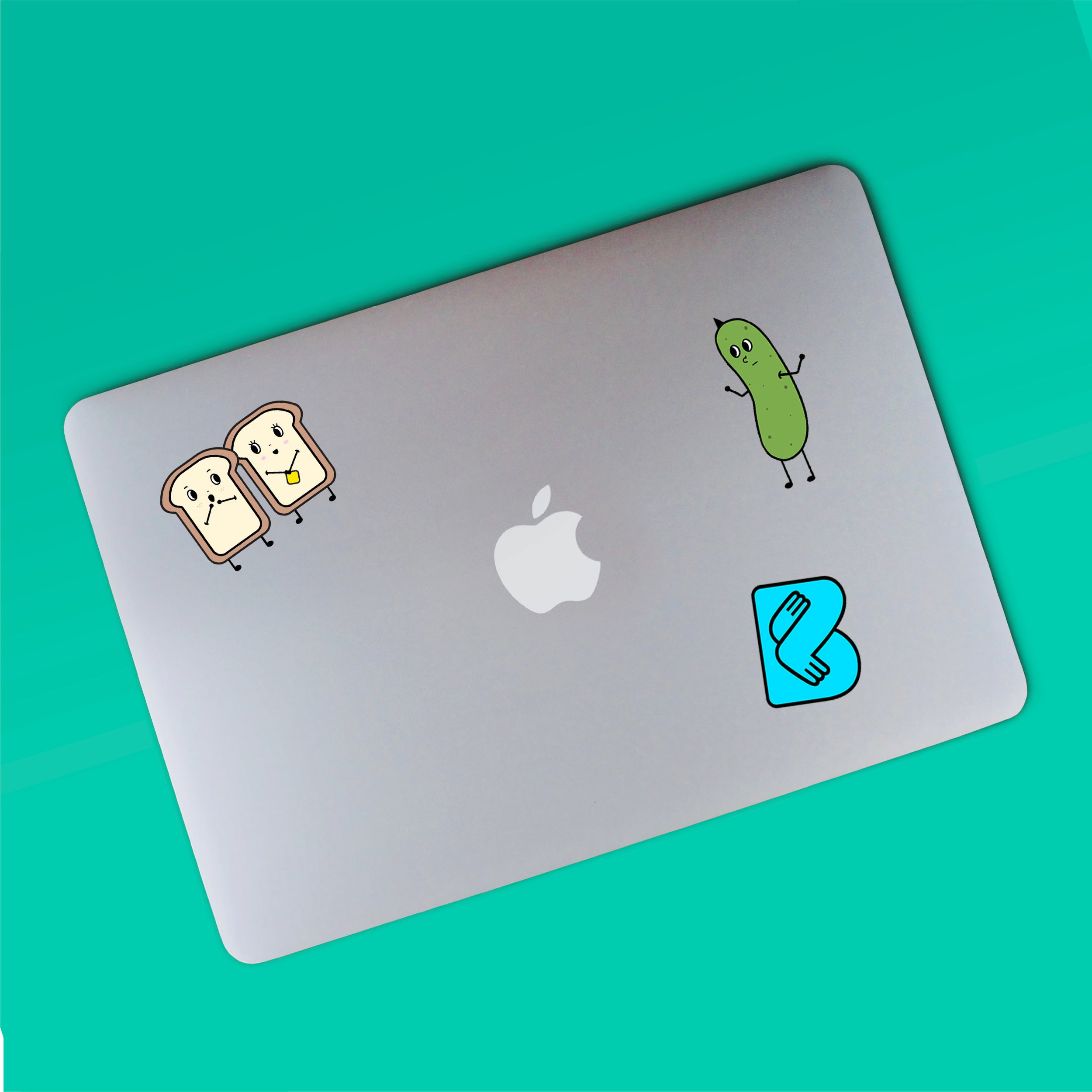

LOGO DESIGN
The name “Embrace” was inspired by a tight squeeze, much like the effect a compression sock has on your feet and legs. While these socks “embrace” your body, you can also embrace your personality and medical conditions through the designs!
The full logo to the left is made up of different shades of blue, a nod to the blue color that represents Type 1 diabetes. The typeface I chose for the logo is very bubbly and graphic, adding to the quirky and fun personality that I was going for with this brand.
The logo mark to the right, which is also part of the full logo, gives the appearance of two feet hugging each other. Fitting for a sock brand named Embrace!

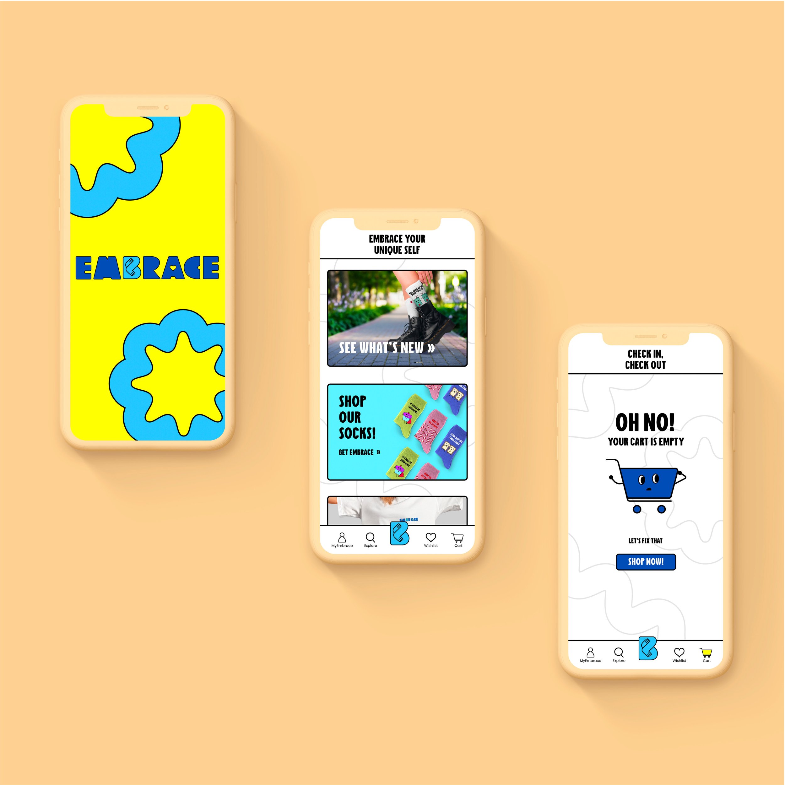
EMBRACE APP
Along with the brand and the apparel, I designed an app where customers could view and purchase product. It was important to me that the brand aesthetic was carried throughout the app design to reflect the products and give a cohesive feel.

RESEARCH FINDINGS
With the help of the Northeastern New York Chapter of JDRF, I was able to gain feedback from members of their Facebook group by posting a survey that I created. I chose to collaborate with this chapter of JDRF as I am already familiar with the organization, and my goal was to reach as many people in my target audience as possible. This way, I could present my idea for Embrace and get raw and honest feedback to adjust where possible based on what people in my intended target audience would want from a brand and product like this.
Key findings from survey:
- 88% of participants were Type 1 Diabetic
- The majority of participants (39%) were aged 23-35 with runner up being ages 36-50 at 18%
- Most people opted for the brighter, happier mood boards in terms of sock patterns and colors
- 85% of participants stated they don't currently wear compression socks on a regular basis, but doesn't mean they won't need them in the future.
Primary reasons for wearing compression socks:
- Improve circulation
- Reduce swelling in feet
- Neuropathy
- Keeps feet healthy
Cons of current compression socks on the market:
- Expensive
- Limited size and style options
- Socks don't stay up over time
Top most important brand attributes from participants:
- Affordable 67%
- Sustainably made 46%
- Donates to a cause/non profit organization 40%
Quotes from survey participants:
“I know that many people are in need of compression socks but I like the focus on diabetes. If you wanted to extended a little bit, you could do so to young mom because gestational diabetes is common and if they are interested in this “tool” for nine months, they probably don’t want something medical and boring”
“This is a cool idea. Even though I don’t wear diabetic socks now, I may wear them some day, and I’ll be glad to see design options when and if that day comes! Best wishes!”